• Recent Portrait Work
    • Calcutta Cricket Club Design
    • Simons Mural
    • Older Work
    • Vase Portraits
    • Archive I
    • Archive II
    • Archive III
  • About
    • Instruction
  • Purchase
  • Press
  • Blog
  • Contact
Menu

Maya Gohill

  • Portfolio +
    • Recent Portrait Work
    • Calcutta Cricket Club Design
    • Simons Mural
    • Older Work
    • Vase Portraits
    • Archive I
    • Archive II
    • Archive III
  • About
  • Services
    • Instruction
  • Purchase
  • Press
  • Blog
  • Contact

My Blog

It's about anything and everything.

It's the good stuff.

It's the intriguing stuff.

It's the fun stuff.

It's the beautiful stuff.

It's the curious stuff.

It's the stuff that makes me smile.

It's the stuff that gets me pumped to DO, to BE, to LIVE.

It's anything and everything.


Latest and Greatest:

Recent Portrait Work
 Art Installation for Fonda Fora at the Westley Hotel
about 2 years ago
 Art Installation for Fonda Fora at the Westley Hotel
about 2 years ago

Maya's Blog

t's about anything and everything. 

The good stuff.

The intriguing stuff.

The fun stuff.

The beautiful stuff.

The curious stuff.

The stuff that makes you smile.

The stuff that get's you pumped to DO, BE, LIVE.


Fresh Tweets:

  • Maya Gohill
    Incubation. This is how I like to think of the period of my scarcity on social media. A profound experience occu… https://t.co/y3PueRbxYp
    Nov 29, 2018, 10:14 AM
  • Maya Gohill
    OK... so this is kinda a big deal. This painting has finally made it’s way home after years of being on the road an… https://t.co/OAOyxRlMRh
    Oct 16, 2018, 12:11 PM
  • Maya Gohill
    The great part about RVing is that I can make the same classy dishes that I do at home. #rvlife @ Radium Hot Spring… https://t.co/EfH1PEEimp
    Aug 20, 2018, 6:49 PM

Painting for Kit and Ace

March 02, 2015 in art, artists, calgary artists

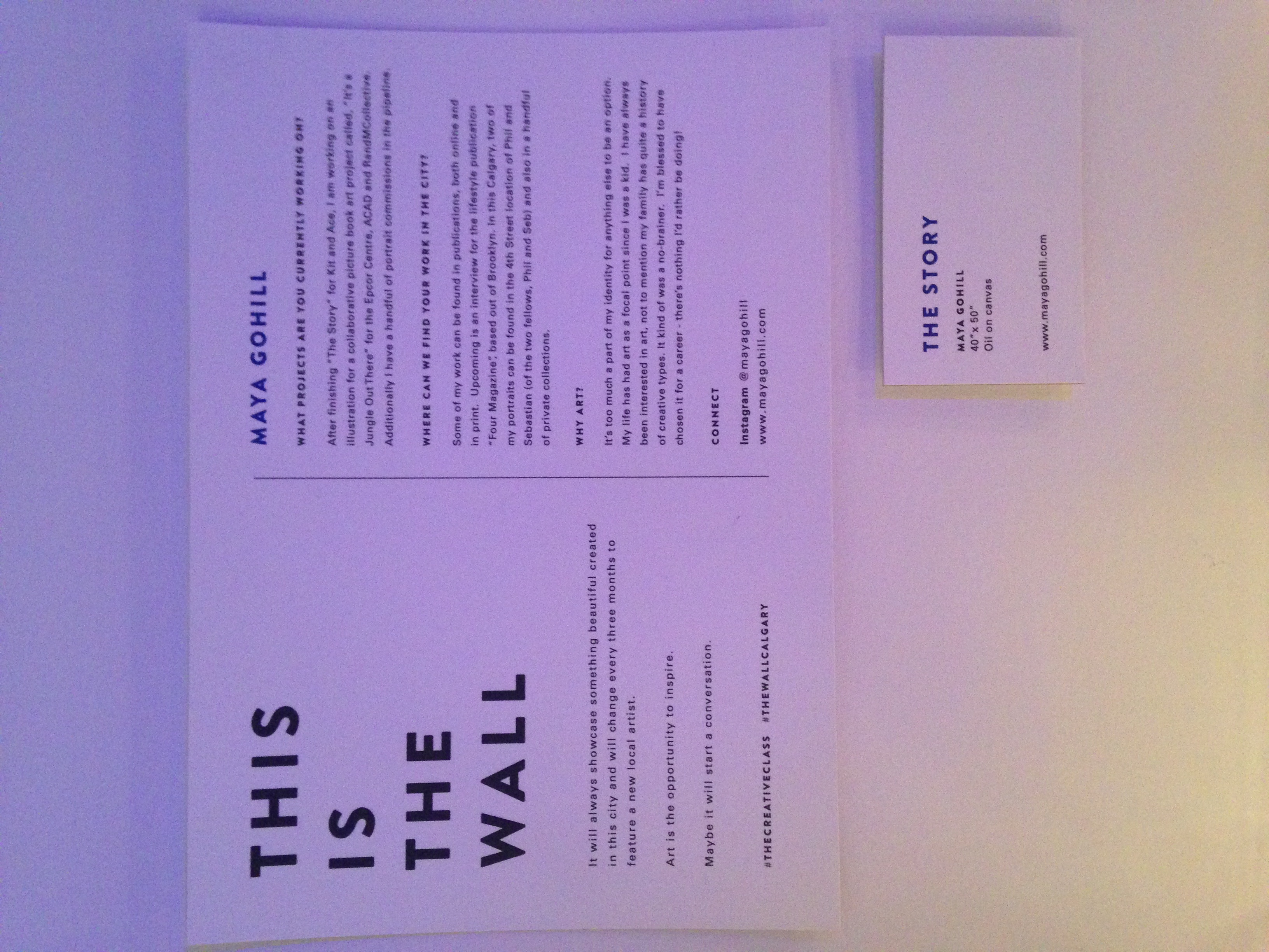
The first time I heard of Kit and Ace was when I received a email from the store manager, Sarah Hutchings, asking if I would be interested in doing a commission for the store opening in YYC.  Knowing virtually nothing about the company, I hit up google for some answers and was immediately impressed by the classic, cool style of the brand.  Then after meeting with Sarah face to face and hearing a bit more about the project and the company’s vision I got a little more excited!  It was so cool to be working with a company whose vision is so fresh and out-of-the-box!

So, began the Kit and Ace painting journey.  (In case you’re wondering, Kit and Ace is the relative of Lululemon.  The founder's wife and son, Shannon and JJ Wilson, began this company that specializes in technical cashmere t-shirts...and other soft and cuddly products. ) 

IMG_5284.JPG
IMG_5386.JPG
IMG_9046.JPG

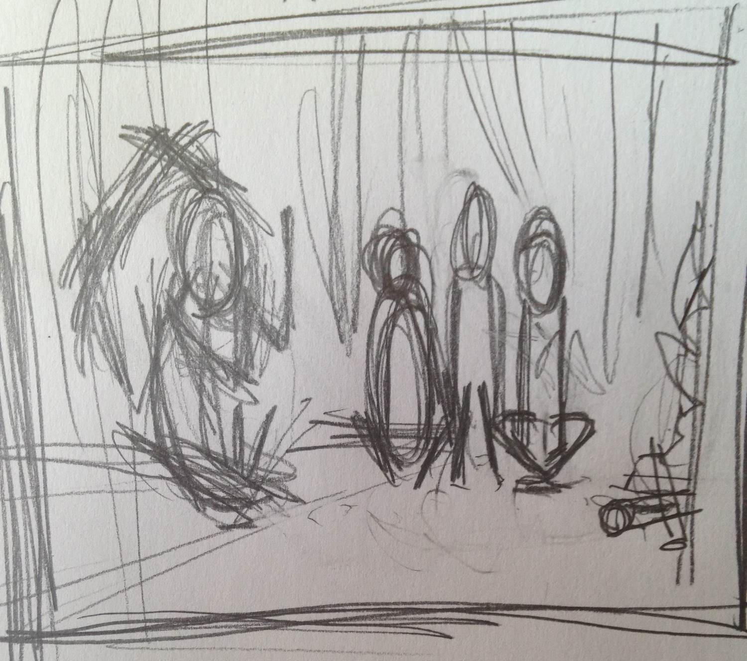
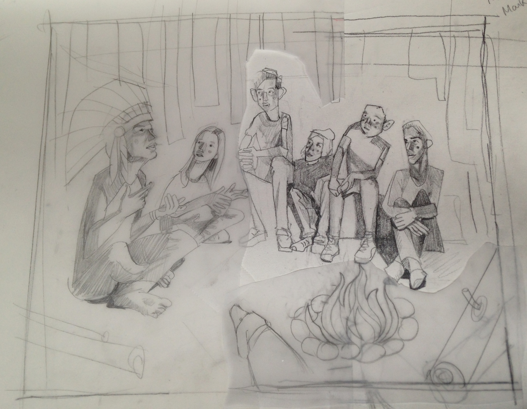
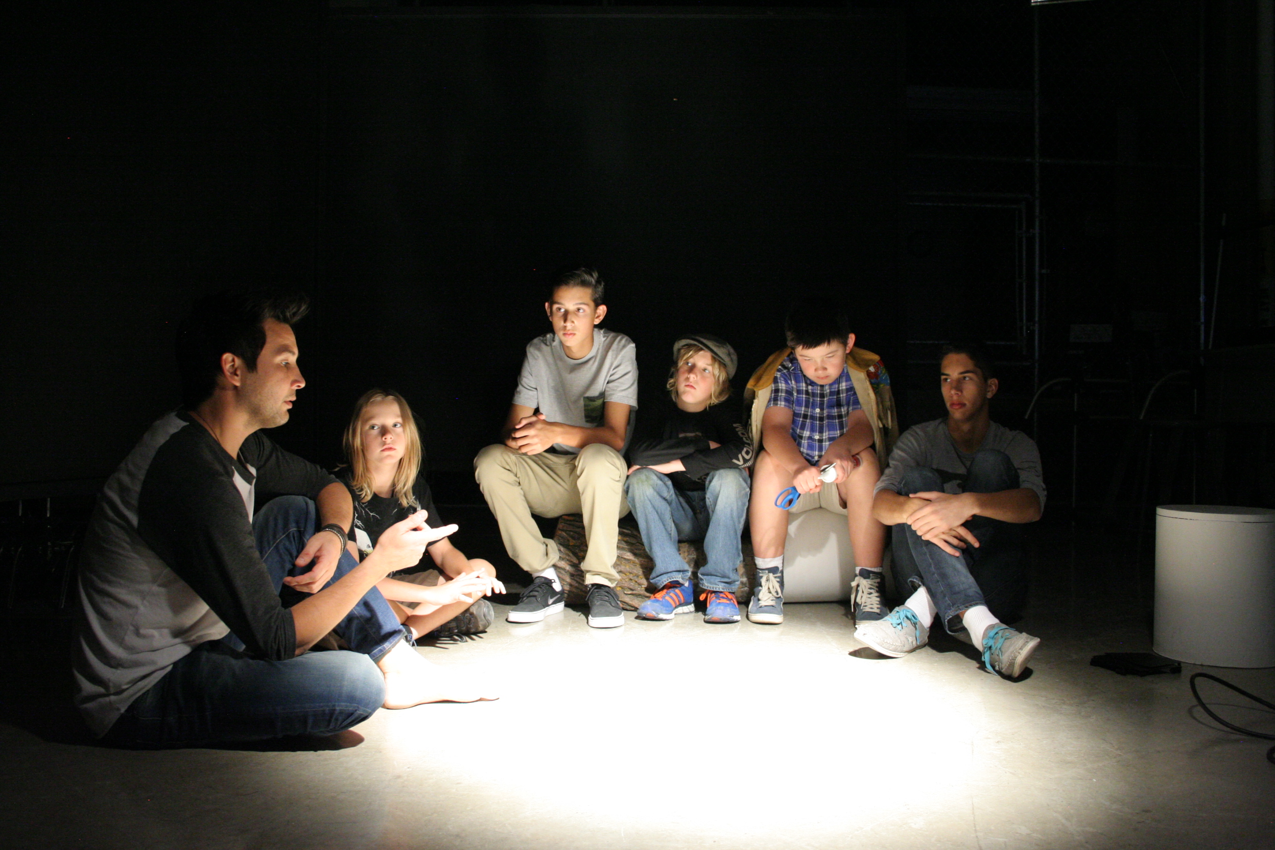
A little glimpse into my process.....The top image is a crude version of the shapes and composition that I visualized - this is me just getting what's in my head out on the paper.  The middle image is a "frankenstein-ed" drawing of what the finished piece will look like.  I rely heavily on the sketch. At this stage, what you see is basically what you get, minus the color and paint.  Finally, the photo above gives you an idea of what the staging was like. I take many many pictures before choosing the best pose for each character.


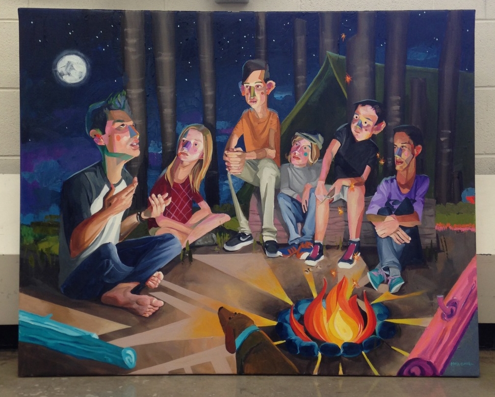
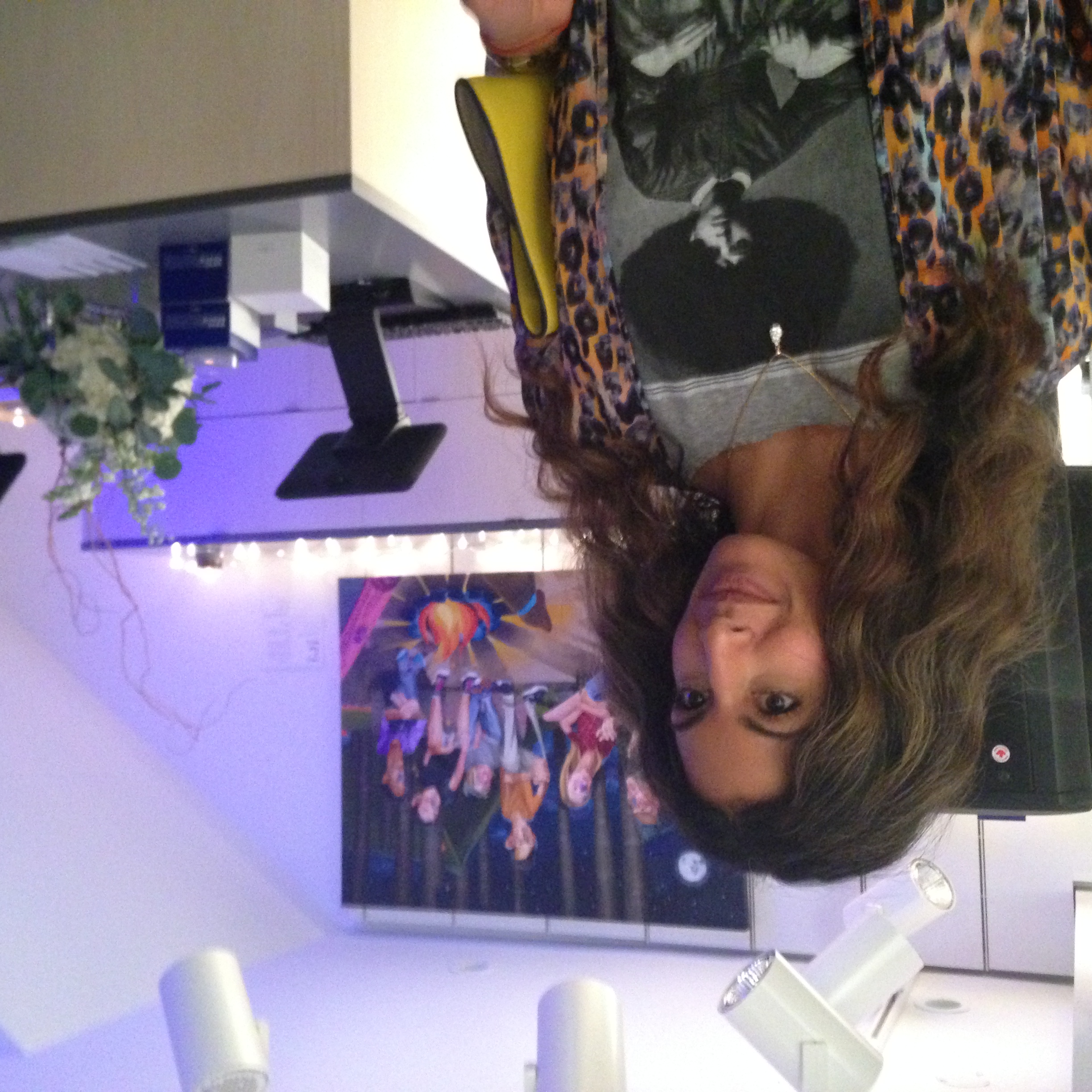
Kit and Ace was kind enough to basically give me free reign on the concept and content of the piece.  The initial idea came to me one night while in my studio, and was inadvertently influenced by Wes Anderson, since I had recently fallen in love with his film the Grand Budapest Hotel and was on a serious WA kick.  The concept was intended to capture the nostalgia of free-spirited, childhood innocence, while growing up in a time of political and cultural incorrectness....The excitement of summertime camps and playing cowboys and Indians...this was the vibe I was going for.   If you look at the original sketch you'll see the camp leader wearing a First Nations headdress.  After a lot of discussion back and forth with Sarah and a friend closely linked to the aboriginal culture, I decided to remove it.  At the time there had been a lot of controversy floating around about the misappropriation of aboriginal symbols in pop culture, and although art is a great vehicle for social commentary, there is a time and place for everything, and this wasn't it.  So, off came the headdress.

View fullsize IMG_5392.JPG
View fullsize IMG_5500.JPG
View fullsize IMG_5506.JPG
View fullsize IMG_5608.JPG

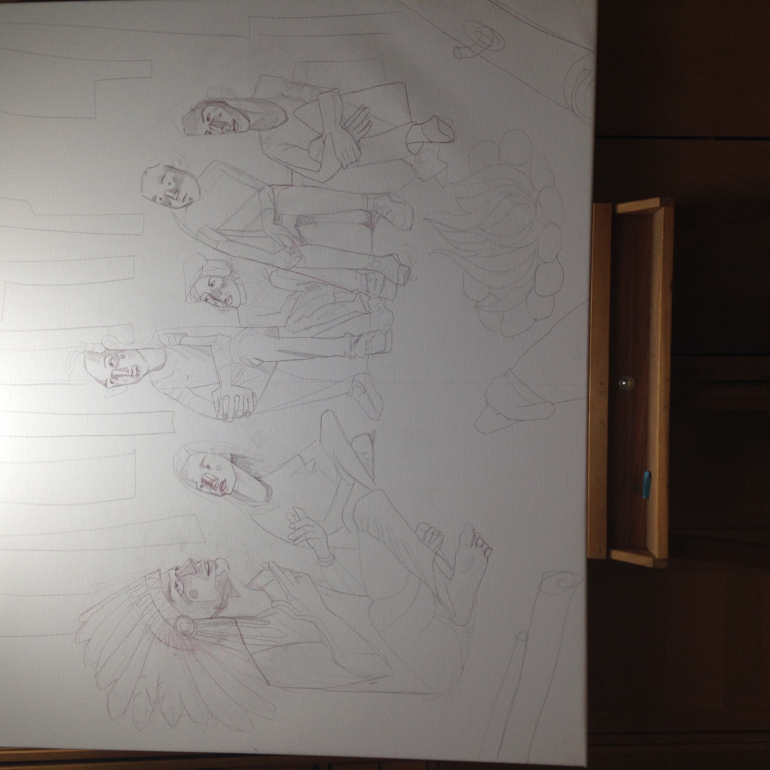
At the time, I definitely had an internal fight with what to do with the empty space behind and around the camp leaders' head.  The headdress carried a lot of visual weight on the left side of the painting and I was disheartened about having to employ a non-existant "plan B".   For the life of me I couldn’t find a satisfying solution that wouldn't be a complete afterthought!  But lo and behold I found a solution, and the solution ended up being the moon.  Pretty magical stuff, if you ask me. :)  

I've decided that it is completely vain to be lovey-dovey with your own art like I am with this piece, but I just can't help myself.  I love this painting not because of the aesthetics, but because it represents the sheer delight of being fully immersed in the creative process and seeing something through to the very end.

IMG_5504.JPG


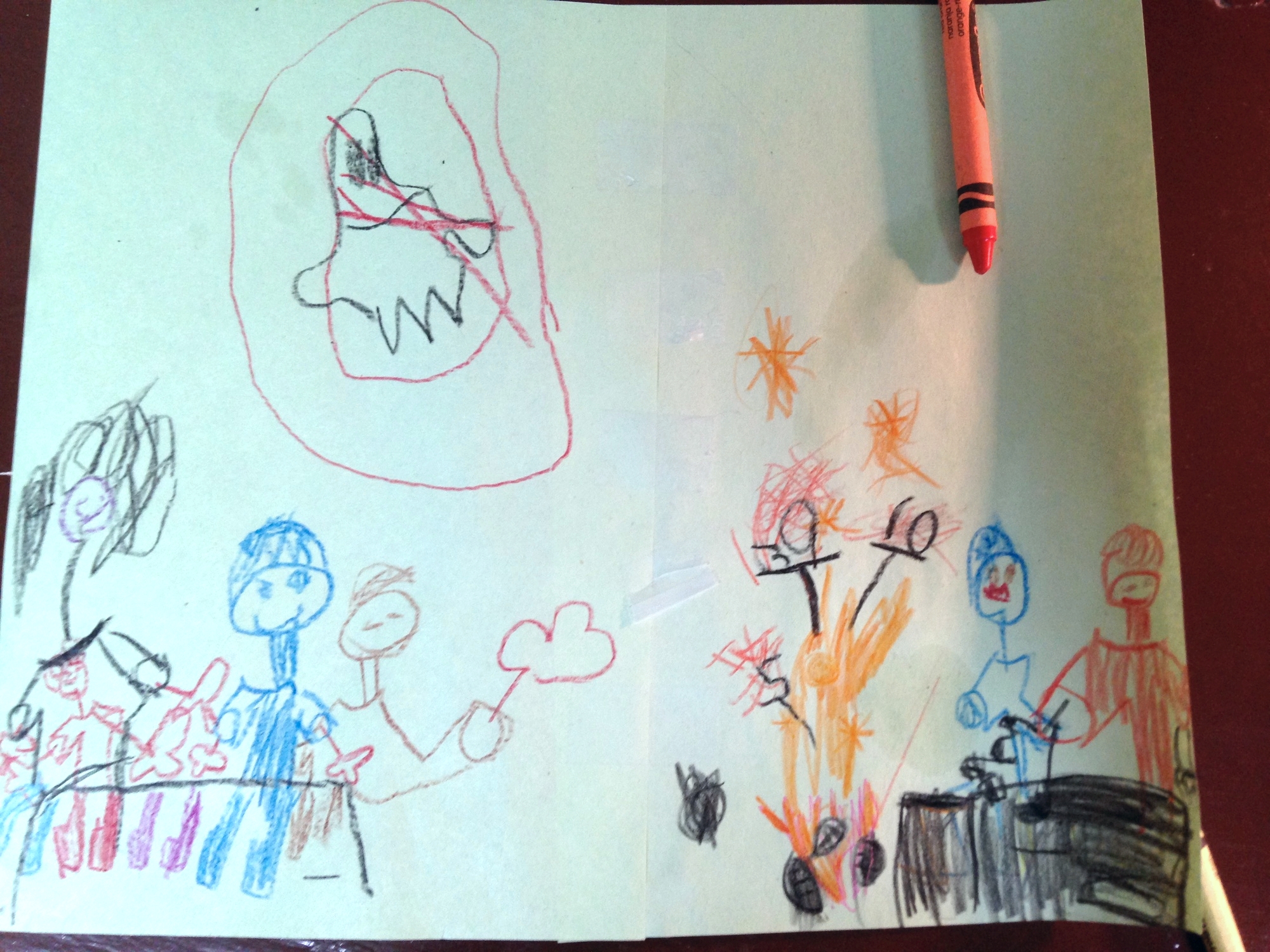
On a side note, my 5-year old was as excited about this painting as I was.  He wanted to be a part of the process too, so he did his own version of the painting. That long-necked, wild-haired figure on the left is me, and in my lap is him, all cute and tiny.  (He got my hair to head-size ratio correct). The red image at the top says "NO GHOSTS".....as in ghostbusters.  Because you can't have ghosts hanging around the campfire, people.   I'm also pretty sure that those black things coming out of the fire resembling 5, 39 and 10, are supposed to be marshmallows roasting on a stick.  Well, either that or they are the numbers 5, 39, and 10 and represent our respective ages, which is also very possible.  Exploding sparklers for a birthday cake perhaps??  It shall remain a mystery. :)


The final piece below, and a few images from the Kit + Ace grand opening....

IMG_5616.JPG
IMG_5901.JPG
IMG_5894.JPG

Thanks for reading!


Tags: art, artist, calgary artist, kit and ace, clothing, fashion, calgary kit and ace, Wes Anderson, oil painting, creative process, drawing, sketches
2 Comments

Avenue Magazine Style Q&A

March 02, 2015 in artists

When it rains, it pours, as they say.   Back in May, I was asked to be a part of Avenue Magazine's Style Q&A.  Before I go into the details, I first want to mention what a great deal of respect I have for this magazine.  I'm proud that our city has a forward thinking, intelligent, stylish publication like Avenue....(and it's free!)

View fullsize MayaRed.jpg
View fullsize MayaDesk.jpg

At the time of the shoot, my home was in the midst of a home reno.  There was flooring a-muck, dust galore, and stranded in the living room were several kitchen appliances!  But looking at the pages you would be none the wiser thanks to the savvy team of photographers and stylists who swept in and literally worked MAGIC in the space.   Unbeknownst to the Avenue reader, the messy details were skillfully omitted, and in it's place was left order and simplicity. 

The vision and talent of this team was amazing. Pivotal to this was Lori Andrews who photographed the shoot.  She has a excellent eye, she's very talented, she's got smarts, and she's a total hoot!  Also on set was stylist Phaedra Godchild of Styleista who brought along her great style, as well as makeup artist Lucy Morris, Art Director Vanessa Brewer who masterminded along with Lori, and of course style editor Ricky Zayshley, whose energy and bright blue eyes brought definite panache to the shoot. :)

View fullsize MayaBlue.jpg
View fullsize MayaBlueBookshelf.jpg

Overall the entire process was so fun!  I especially loved working with the wonderful people who were involved, and I feel grateful both for the opportunity itself, and for the chance to make some new friends!  

P.S.  if you'd like to read the full article, click here.

My little guy also made a little cameo appearance, which was the highlight for both of us!  Thanks again Avenue, and thanks Universe.  

Tags: avenue magazine, style, personal style, fashion, calgary, yyc style, artist, art, painting, lifestyle magazine, calgary fashion
1 Comment

Just a little snip-it of what the ad campaign looked like.

Nordstrom!

September 02, 2014

Here it is! The Nordstrom ad campaign!!  Nordstrom did a fabulous job with it, and they deserve a lot of koodos for personalizing the campaign for Calgary's audience and including it's own people in the campaign. It's a concept I've never seen used before by any company, let alone a massive fashion retailer such as this.  I, along with the rest of YYC, love and appreciate this personal touch, and I can't wait for the store to open, Sept 19th!  Additionally, they had the amazing Tommy Tom, street style photographer extraordinaire do the entire shoot.  Love Love Love his work.

Part of the campaign for the YYC store opening in Chinook Centre,  included 100+ stylishly cool Calgarians, photographed by the talented duo Ania B and Tyler Stalman, featured on the Nordstrom blog The Thread.  To see the FULL ad campaign the other local talent who was involved in it click here, (...and to start shopping!)  To read more about the involvement of the citizens of YYC in the ad campaign, check out this article from the Calgary Herald.


Ania B and Tyler Stalman

Ania B and Tyler Stalman


calgary-stalman-3.jpg


Tags: nordstrom canada, calgary nordstrom, maya gohill, calgary artist, artist profile, fashion, we love your style, yyc, nordstromadvertising campaign, chinook centre, artists in calgary
Comment
Newer / Older
Back to Top

email: art@mayagohill.com
phone: (403) 466 - 3177